Showing posts with label art. Show all posts

Sunday, November 30, 2025

Pyrographic presents

As the end of the season approached, and it came time for us seasonal field technicians to say goodbye to NEON, I decided to make some little gifts for all my coworkers. Between moving and work I didn't have a lot of time to think about it (or make things) so I settled rather hastily on some small wood-burning (pyrography) pieces. Since I get bored of doing the same thing over and over I decided to do a unique design for each person based on what I knew they liked or enjoyed about the work we did. I've grouped them into a few categories below:

1. Plants

ʻĀhinahina (silversword) and Peperomia sp.

I did these for two coworkers who mentioned these plants as being their favorites. On the left is a Mauna Loa silversword (Argyroxiphium kauense), or ʻāhinahina in Hawaiian. We were privileged to see some of these that were outplanted in the Puʻu Makaʻala Natural Area Reserve (out of reach of voracious ungulates!), and they're just as beautiful as the Mauna Kea species.

Leaves of Peperomia sp. from beneath

The disk on the right shows leaves from a species of Peperomia (using the photo above as reference). There are over a thousand recognized Peperomia species (at least twenty-two in Hawaii alone), and there are thought to be more since they can be hard to tell apart and positive identification can be very difficult. While we normally would (and could) identify most plants to the species level with confidence, we simply couldn't identify any peperomias we found to better than the genus level. They're pretty plants, though, with strikingly-colored undersides to their leaves.

2. Beetles

Mecyclothorax neonomas and M. rufipennis

As part of the work we did we collected, identified, and preserved various Carabidae beetles. Members of this large and varied family are found around the world, with both native and invasive species present in Hawaii. Shown here are two native species from the genus Mecyclothorax, M. neonomas on the left and M. rufipennis on the right. M. neonomas was actually discovered just a few years ago at our site from the kind of collection work we did (one of two such species), which is pretty neat! We didn't find any new species this year (beetles in general were scarcer than the previous few years), but there could be more out there waiting to be discovered…

3. Birds

Nēnē, ʻiʻiwi, & ʻalalā

Birds ended up being the biggest category, as we got to see a lot of endangered and rare native birds in the Natural Area Reserve. Nēnē were a very common sight; we would often see between ten to twenty on any given day. (This was the first one of these wood-burnings that I made, so it's a bit less polished than the others as I was relearning it on the fly). In the middle is an ʻiʻiwi, a striking native scarlet honeycreeper with a dramatically curved bill. I modeled this after a photo of one perched on a māmane tree, and while I didn't get its front quite right I like the contrast with the black wing and tail feathers. (The light was at a poor angle for this disk specifically, so I had to play with it a bit in GIMP to get it to look better.)

The third bird is one which I haven't actually seen personally, and isn't currently at the site: it's an ʻalalā, the Hawaiian crow. By 2002 there were no known wild individuals, with just a few remaining in captivity. Intensive breeding and rehabilitation programs have increased the captive populations to the point where some individuals were released into the Puʻu Makaʻala Natural Area Reserve several years ago…where they were unfortunately quickly predated by ʻio, the Hawaiian hawk. One of my coworkers, before joining NEON, was part of this effort and used to track the birds around the reserve, so I made this for him. (Amusingly, he immediately could tell from it that I'd used a reference photo of a not-quite-adult bird ­– something I didn't know – as its head was still a little big for its body.) In some good news, around a dozen ʻalalā were recently released in the wild on Maui where there are no ʻio, so hopefully they'll be able to re-establish a wild breeding population there and eventually bring them back to the forests of Hawaiʻi.

4. Tower

The fourth and final category has just a single disk, but it's probably the one I'm most proud of. I made it based on a photo I took of the top of our instrument tower seen through the trees along one of our trails, and I managed to get a lot of details in there. Here's the photo in question, for reference:

Funnily enough, this photo is now out of date: two weeks ago, during my last week with NEON, some site infrastructure people came out and moved one of the boom arms visible on the left to the other side of the tower to better sample the prevailing wind direction. When the tower was originally built in 2018 it was laid out using data on wind direction from Pohakuloa up on the saddle, and no one seems to have thought to question if the wind patterns were the same for a different site. (Spoiler: they aren't.) Our tower had thus, for its existence, had the wind-sampling equipment off to the wrong side for the prevailing winds. It wasn't a huge problem by any means (the tower being in the way probably wasn't affecting things too much), but it's good that it's fixed now.

And that's it! It was nice to have motivation to pull out my wood-burning kit again; when I originally got it I imagined I'd be doing a bit more than I have (so far it's pretty much just been the two pieces in this previous post). Several people said I should sell these, which…with some more practice…we'll see if that goes anywhere, I suppose. A hui hou! (And if any of my coworkers are reading this, thanks for being such an awesome group of people!)

P.S. Also, after a week of intensively cleaning my old place, I'm finally fully moved out, and can concentrate on things around the new place.

Saturday, August 31, 2024

Painting a solar filament

I haven't done much painting since moving back to Hawaii. I'm not sure why, other than that I just haven't felt very motivated to do it; perhaps because it started as something of a social activity in Australia and I haven't replicated that feeling here. However, back in May, the Astronomy Picture of the Day website had an image of the Sun from the Solar Dynamics Observatory which really inspired me. It showed the limb of the Sun with a filament stretching out from behind it towards the foreground, which gave it a strong sense of three-dimensionality – something often lacking in astronomical images. I thought I'd take a shot at painting something like it, leading to the painting below:

Solar Filament, 12"×18", acrylic on canvas.

I'm not entirely happy with how it turned out – especially when comparing to the infinitely more dynamic and vibrant inspiration – but I've learned that sometimes it's best just to draw a line under something, take the lessons learned, and move on, rather than striving in vain for perfection. Though for being the first moderately intricate thing I've painted in a few years now, I'm also not too unhappy with it. I learned (and relearned!) multiple things about painting while working on it, which I'm sure will come in handy the next time I feel like painting a star.

I tried to replicate the colors from the reference images somewhat, such as having the hottest parts of the surface be white. It didn't quite come out like I'd hoped, which actually characterizes a fair amount of my color-mixing experiments over the course of this painting – but in the process I remembered how much fun it is mix colors, to arrange them as I like, and the physical application of paint on a surface. Speaking of surfaces, that's one thing I think did go well: before coloring the Sun, I laid down a thin layer of flexible modeling past, then lightly tapped all over it with my finger to create an appropriately fractal, rough surface. (I later realized I should've done something similar where the filament goes beyond the solar limb and had to improvise with some stiff paint, but that's part of the learning process!)

In-progress image showing the texture on the Sun's surface.

I thought about using glass beads like some of my previous stars, but it didn't quite feel right for this painting, and I think that was right call in the end. Overall, I'm happy enough with it to share it here, and it has reminded me of the simple joy of painting. I don't know what I'll paint next, or when, but I do have a few ideas rattling around in my head, so we'll see where things go. A hui hou!

Sunday, March 31, 2024

Local sculpture

Two weeks ago I was invited by my friend Ken (whom I've gone on excursions with before) to come along with a local photography club to visit the sculpture garden of a local sculptor, Mike Shewmaker. While I only found out during the visit, I've been passing by one of his sculptures in downtown Hilo for years; it's located near the corner of Kilauea Avenue and Keawe Street, by the Subway. I'd never actually paid much attention to it, but when I saw some of Mike's other work and someone reminded me of the one downtown it instantly clicked.

The sculpture downtown; a plaque mentions that the primary meaning of “hilo” is to braid or twist. 

Mike's sculptures tend towards the abstract primarily, with a number playing on this theme of curving, looping structures seemingly frozen in motion. He was there to meet us and talked about the creation process at some length; interestingly, he designs them in miniature, then has them constructed, and hasn't yet found a design his construction team couldn't handle (even when he was deliberately pushing the limits!).

I quite like this one with the single curly tendril.

Another similar to the one downtown, with some others in the background.
Altogether he has quite a few; with his permission I got the aerial shot below with my drone, and I think I count upwards of forty! Plus the one in Hilo, and he mentioned he has another one going up somewhere in Volcano soon. It was a very interesting visit and chat that lasted over two hours, though the clouds and intermittent light rain made me completely forget about sun protection, resulting in a mild sunburn(!).


Overall it was a fun excursion, and interesting to meet the artist behind a sculpture I go by pretty much every week. Happy Easter! A hui hou!

Friday, August 19, 2022

Experiments in AI-assisted art: DALL•E

You might have heard about DALL•E (a combination of Dali and WALL•E) sometime in the past year or so, a machine-learning AI system by a research team called OpenAI which can take a natural language prompt like “A corgi made of jello dancing on top of a ball” and produce an image based on it. It can mimic a huge range of styles from realistic photographs, to digital art, to hand-drawn sketches or paintings, and has produced some remarkable output. It got some coverage back around June when the team behind it started opening up access to a few people, who started sharing the images they were using it to create. I happened across the form to request access, and, intrigued, signed up, not expecting for a moment that I'd get it without entering a Twitter, Instagram, or LinkedIn profile. Near the end of July I saw an article that OpenAI had opened DALL•E up to a million people, and imagine my surprise when I got an email notifying me I'd been selected.

A corgi made of jello dancing on top of a ball, realistic photo, by DALL•E
“A corgi made of jello dancing on top of a ball, realistic photo”, by DALL•E.

Above you can see one of the images I created with DALL•E. I was trying to explain it to someone as, “That new AI system where you put in a crazy phrase [at which point I tried to come with the craziest phrase I could think of] like, ‘A corgi made of jello dancing on top of a ball,’ and it spits out an image of it.” And then, well, I had to actually try it and see what I got. (DALL•E actually produces four variations every time you give it a prompt, which will look generally similar but have some differences in style, allowing you to choose the one you like best.)

An Impressionistic painting of the Gemini Observatory on the summit of Mauna Kea in the style of Vincent Van Gogh, by DALL•E
“An Impressionistic painting of the Gemini Observatory on the summit of Mauna Kea in the style of Vincent Van Gogh”, by DALL•E.

It certainly has some quirks. While the site encourages you to be descriptive and specific in the prompt you give, it's hardly perfect at interpreting what you mean. In the image above I asked for two very specific things (the Gemini Observatory and Maunakea), and while it's done a decent job of an image (I rather like the composition of this one) it's inexplicably given the observatory two domes instead of the single one it has in reality. (DALL•E was weirdly fixated on the notion that Gemini = two domes, as I tried several variations on this prompt and pretty much all of them had that feature.)

A delicious-looking hamburger in the shape of a Rubik's cube, professional food photography, by DALL•E.
“A delicious-looking hamburger in the shape of a Rubik's cube, professional food photography”, by DALL•E.

One funny article I read recently had the author playing with phrases like “X in the shape of Y” in regards to food, which led me to try the prompt above. (Which, side note, looks scruptious and I would totally eat.) I find, in general, that DALL•E works best if you give it a fairly specific prompt about generic objects, though you can certainly include phrases like “in the style of X artist.”

There's been some hand-wringing online about whether DALL•E might lead to the death of various creative professions in the visual arts, like concept artists. Having played with it, I'm not too worried. Oh, sure, as it rolls out to wider use there'll probably be some changes, in the same way powerful new tools have always produced changes. There will probably be a lot of small jobs that might've been done by hand before that DALL•E will replace (stock photography, in particular, is something that DALL•E could fill in for quite well I think). But as my experiments with it showed, there are things I can see in my mind's eye which I can't figure out a prompt to produce with DALL•E, and if I want to show them to the world I still need to pick up a paintbrush or break out Blender or something to that effect. Sometimes something DALL•E puts out sparks something in my imagination, which is neat; I'm actually half-tempted to take my paints to the summit of Maunakea and attempt an Impressionist painting of the Gemini Observatory myself now. Ultimately we're just on the cusp of AI-generated images from natural language prompts (there are several other models around pursuing similar things), and we'll just have to wait and see where it takes us. I read about someone using DALL•E to produce a logo for a program they wrote, which I thought was a neat use of it.

For now, I'll keep throwing in the occasional crazy prompt I think of. While writing this post I had the thought that perhaps it would be useful for generating images for text-heavy posts where I don't have a photo or something else to break it up. I often find it surprising how well DALL•E can handle fairly abstract or abstruse concepts. We'll see how it goes, but you might start seeing more DALL•E images around here in the future. A hui hou!

Friday, September 10, 2021

An idealized Australian afternoon

As of today, it's one week until I fly out of Melbourne. Seven days from now at this time, assuming everything goes swimmingly, I'll be in Sydney, followed—at some point afterward which times zones and the International Date Line make more confusing to calculate than I feel like doing at the moment—by being back in California to visit my family for a week, before flying on to Hilo. This next week is going to be a whirlwind of activity as I get everything ready to move.

For today, however, I wanted to share a painting—well, two paintings—which I'll be mailing to my grandparents this week as a souvenir. I've been informally calling this the “Grandparental Diptych,” but let's go with “Australian Afternoon” as a formal title. I'm almost certainly not going to have time to paint this week, so these'll be the last paintings I finish here in Australia.

“Australian Afternoon,” 60×15 cm, acrylic on canvas.

It's an idealized Australian landscape rather than a specific place, with a few eucalyptus trees in the foreground (and a few Australian animals in them). To represent the hundreds of species of eucalyptus trees in Australia, I painted all three trees with different techniques for the leaves and different combinations of colors make them unique (though trees in general and eucalyptus in particular are still something I could use a lot of practice on!). I've discovered I really like doing these multi-panel pieces, such as to explore more extreme aspect ratios than you would normally find, like the 4:1 ratio here. I've got a few ideas for future works utilizing such techniques squirreled away in the back of my mind, though I'll probably have to put any painting on hold for a few months while my art supplies make their way across the Pacific.

I thought for this work it'd be interesting to try to create two pieces which could each stand on their own as an independent composition, but also work combined as you see here. I'm not entirely sure how well either aim worked out, but it was an interesting learning experience all the same—I certainly still have much to learn about composition! Anyway, time to get back to the million and one things to do before I leave. A hui hou!

Tuesday, June 22, 2021

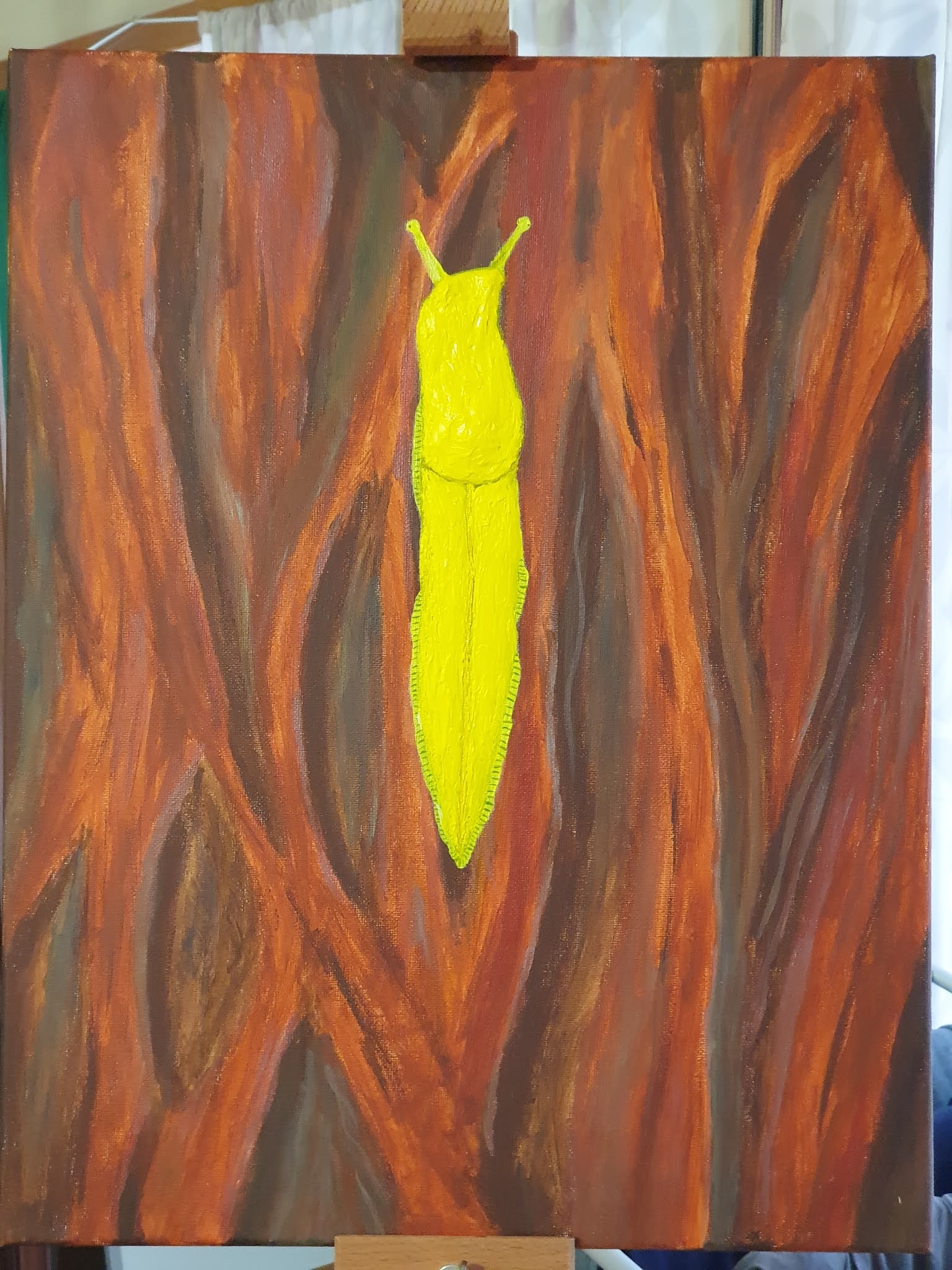
Banana slug on a redwood tree

After all my May posts I got a bit tired of working on my banana slug painting (another reason I don't usually show off things I'm working on—too much self-inflicted pressure to finish), but I finally got around to finishing it over the past few weeks. There wasn't that much to do, actually, since the last photo I took, but I think I'm done with it now. (Of course I also thought that about my first slug painting and then heavily revised it twice, so we'll see if that feeling sticks!) Now, behold the second painting in what I hope to be my ongoing “Limax” collection:

A painting of a banana slug on a close up of a redwood tree.
“Banana Slug on Redwood,” acrylic on canvas, 14”×18”
This face-on photo unfortunately conceals the three-dimensional nature a but, but does reveal my secret inspiration behind the entire painting: the slime trail! Which came out looking crummy. I got the inspiration for it from my earlier solar twins painting, where I discovered almost by accident that a light brushing of iridescent medium makes for a pretty good imitation of the Milky Way's sheen…but also of a gastropod's slime trail if the light catches it right. I'm not sure why it worked in that painting and so well in this one. Possibly the color of the underlying background matters—in the previous painting the iridescence is on black, whereas here it's on a light reddish-brown. It might also suffer from my trying to paint a slug trail from memory based on the occasional snail trail I see around here when walking rather than from a reference photo. Oh well. I'm still pretty happy with the 3D aspects of the painting, and the bark came out pretty nicely too. (It might be interesting to try some more 3D bark sometime, too…) That's it for now, but I've already started on my next project, which I hope to have finished before too long. A hui hou!

Friday, May 28, 2021

Mercury: Birthday #133

Finally, rounding out this month of birthdays, it's Mercury's turn! And wow, 133! Over twice as high as Venus. Getting three Mercury birthdays per Earth year really puts in perspective just how fast it goes around the Sun (every 87.97 Earth days). There's an option, when setting up the planetary birthdays calendar, to skip every so many Venus and Mercury birthdays, but I don't want that. Being 133 on Mercury doesn't make me older—or feel any older—than I am, and I want to see just how many birthdays I can rack up there.

Much like Venus, Mercury has a rotational period much longer than an Earth day. It also exists in a 3:2 spin-orbit resonance with the Sun. This fact in particular makes figuring out how long my birthday has actually been happening on Mercury…complicated. A solar day on Mercury is 176 Earth days—even longer than Venus' 116.75—so in theory my Mercury!birthday has been going since mid-March (coincidentally around the time my current Venus birthday started, though it will outlast that one by going till almost mid-August…just in time for Mercury to make another lap around the Sun on August 24th). The whole concept of a birthday really kind of breaks down on Mercury, since laps around the Sun are twice as common as sunrises, so I think I'll end this speculation here.

Instead, let's get back to slugs! Er, slug paintings. If you remember from last time, I'd decided to build up the slug with some flexible modeling paste. I've done just that in this next photo…

…though it's admittedly hard to see a difference from the previous photo. Just trust me when I say that I've built up the body a bit, and also closed the gap between the front and rear parts. It now feels much more like a real presence on the canvas.

I felt that the modeling paste buildup was complete, so I moved on to painting. You might wonder why I'd need to do any painting, since I've been mixing some yellow paint in the modeling paste as I go along, but there are two reasons for it. For one thing, the modeling paste is very, very, viscous. You can see in the photo above that it preserves individual brushstrokes in incredible detail. Each session working with it requires a lot of time very carefully flattening its surface, trying to keep the most egregious ridges down. But this is a slug, and should be more smooth-looking! (Though banana slugs do actually have some mild texture on their latter two-thirds, which I still need to figure out how to represent.)

The second reason has to do with reflections. When dry, modeling paste is quite a matte material, meaning it doesn't reflect light in concentrated spots; it has diffuse, rather than specular reflection. It's the opposite of glossy, which is more like how we expect a slug to look. So the purpose of painting the modeling paste is two-fold: to smooth out some of the texture caught in the paste, and to give it a more glossy reflection.

And here it is after the first coat of glossy paint. This light isn't the best illustration (especially because, in the previous photo, the still-wet modeling paste also shows some weak specular reflection), but you can kind of see how it looks smoother and more glossy. Most paints are somewhere between glossy and matte, and I've got some gloss gel and some matte gel that can be added to tip the balance one way or the other. I used matte gel in the paint for the bark background, which should make the contrast with the glossy slug all the more obvious.

It's definitely coming along quite well and looking mighty nice, but I'm not done yet! I still have a few last little touches in mind, so there'll be (at least) one more post finishing up this journey. I also  unexpectedly* managed to get a video of the total lunar eclipse last night, so expect that soon as well. A hui hou!

*It'd been all or partly cloudy from a big weather front all day so I really didn't have much hope for the evening, but then it cleared up about an hour before the umbral portion of the eclipse began.

Sunday, May 16, 2021

Earth: Birthday #32

Yes that's right, it's time for the big binarily-significant \(2^5\) birthday! Here on Earth anyway. Now there's just my Mercury birthday to wait for later this month. I don't have much more to say about it—you've heard the song and dance by now—so let's get back to talking about…

…this painting. If you remember from the previous post, I'd tried painting the shading of the slug from a picture, and decided I really didn't like the outcome. I then had the thought that perhaps this was a job for my favorite trick of putting some dimensionality into a painting by extruding it into the third dimension. It's unfortunately a little hard to tell due to the face-on angle of the above photo, but I've painted over the slug's body with some flexible modeling paste mixed with a little yellow paint. I immediately liked where this was going much better, so this'll be the new direction for this painting. I did another painting session adding more modeling paste to the posterior two-thirds of the slug's body, and tried to get a photo from a different angle that would show the topology a bit better:

It's still not the best lighting, but hopefully you can see how I've built up a kind of crest ridge along the back (as the real slugs indeed have). I need to go back over it and even it out with the front a bit, but I'm really enjoying this sort of…reverse-sculpting? The modeling paste is apparently marble dust in acrylic, so it's almost like the reverse of sculpting something out of a block of marble. One tricky aspect of the paste is that it's very plastic and easily retains brush strokes, so it's a very delicate process and when I've got it built out to where I want it I'll have to give it all a layer of paint to smooth it out a bit. Still, I suppose the little imperfections keep it from looking too perfect and give it some character. This photo's from the latest painting session a few days ago, so I'll have to get back to it to have something to show…for my next birthday! A hui hou!

Thursday, May 13, 2021

Venus: Birthday #52

Today I have my 52nd birthday on Venus! Well, this Earth day. Days on Venus are a lot longer due to its slow rotation, and then when I looked it up I had to wrap my head around the difference between a sidereal day and a solar day again. On Earth, with its fast rotation, the difference between the two is only about 4 minutes. On Venus, with its slow retrograde rotation, the difference is about 126 Earth days.

Given that we generally mean solar day (the time between when the Sun reaches its highest point in the sky) rather than sidereal day (the time when a planet makes a full rotation with respect to the background stars) here on Earth, I'll do the same for Venus, which has a solar day of 116.75 Earth days. By that metric, it's been my birth“day” for almost two months (~58 days, so since mid-March) and will continue to be until early July. Which is pretty cool I suppose!

Anyway, continuing on with my in-progress painting, I'd left it with the beginnings of a bark texture. As mentioned, I didn't follow the color of my tree model, and that's because this is supposed to be a redwood tree. And on that redwood tree will be a majestic banana slug. I somewhat dislike giving away the final vision this early on, but as I started painting it in I can't show off more photos without revealing it. Nothing for it but let you all in on the process, I suppose!

Here, the big change from last time is actually not the beginnings of the slug I've started painting in, but the extra detail in the bark. I went over it again with a few colors, including gray. This turned out to be a much more important color than I'd anticipated, at it helped tone down the colors a bit and make them feel a bit more muted and natural, while making the saturated colors pop more.

Of course, the rough sketch of the slug is pretty eye-catching. I used some bismuth yellow to fill in an underlayer, and it turned out pretty fluorescent. A bit too fluorescent, so I painted it over with…

…this. I was attempting to do some shading from a photo, but A) I'm bad at shading, and B) it didn't exactly fit with the shadows from the bark. Almost every part of the slug here except for the outer fringe of its foot will be covered over…in the next post! Yes, I'll leave it here, and do some more work on it over the weekend. (Also, you might be able to see that I replaced the light bulb in my room with a brighter one in between the two photos.) Anyway, see you for my next birthday! A hui hou!

Thursday, May 6, 2021

Mars: Birthday #17

In the first of this month's birthdays, today I have my 17th birthday on Mars. That'll be the lowest number we see this month, since Mars orbits the Sun the slowest.

To give me something to talk about in these posts, I've decided to do something I don't normally do and post some photos of a painting in progress. I started this one in March, and it's not finished as of today, so this will be some good motivation to keep working on it. It was actually directly inspired by my previous painting, though I expect the link will not be obvious; I'll reveal it when the painting's done, and leave it to your imagination in the meantime.

Anyway, for this painting, I needed a background looking like bark, so I decided to try something new and do some plein air painting. En plein air is a French term meaning “outdoors,” and plein air painting is the act of painting outdoors, as opposed to inside a studio. While I could simply look up bark textures online, I decided I wanted to paint one from life, so I packed up some supplies and headed out to the nearest tree.

Setting up the easel and canvas next to my model.

Turns out plein air painting, especially with acrylics, is a very different beast to painting indoors. I picked a moderately sunny day, and my acrylic paint—already known for drying quickly—was drying even faster both on the palette and the canvas. I made liberal use of the spray bottle I brought with me, furiously misting everything in an attempt to keep everything damp enough to work with, but still ended up rushing to capture the texture as quickly as I could (I sketched it out roughly on the canvas first). While this generated a unique sort of pressure to the painting, I don't think it was negative, exactly; I ended up using some very fast, loose brush strokes, which gave it a somewhat freer quality than normal for me, I think. Anyway, here's a shot I got of myself with the finished product:

The Sun came out from behind the clouds after a while.

…and here's a closeup of the canvas:

Sort of looks like bark, if you squint?

As you can see, I only used the tree as a reference for the texture, not the color. As to why I chose the particular colors I did, well, that's part of the composition…which I'll reveal on my next birthday! For now, I'll leave you with the fruit of my first experiment in plein air painting, while I get back to work. A hui hou!

Tuesday, April 27, 2021

A tendril of fire

Last year I painted a scene of a star and planet which I showed off in this post, the same one that appears below. I left it at my desk when I started working from home in March, not anticipating that I wouldn't see it again until November. At the time I think I still had some ideas for changes to it, but as it was mostly done I decided to show it off anyway.

Around the start of this year I brought it home, with a hazy idea of “finishing” it. I realized, however, that I'd ended up forgetting what ideas I had in mind in the intervening time, so I decided to simply sign it (and make a few last little touches) and declare it finished. I also don't remember if I ever had a name in mind for it, so I had to come up with a new one: “Tendril of Fire.”

“Tendril of Fire,” 14×18", acrylic and glass beads on canvas.
I already wrote quite a bit about the creation of this painting in the post linked above, so I won't reiterate here. I'll just point out that I'm proud of how I worked my signature in at the bottom-left in the star's atmosphere; writing in the style of solar flare has been something I've been interested in for a long time, as seen by my initial spin on the idea. Other than that I like how the end of the large flare/tendril turned out, those little wisps of color being the final touches I put on it. It really looks like a magnetic field has snapped and the plasma is flying out away from it. That's pretty much it for this painting, though when I showed it to my brother he may have given me an idea for another, so we'll see if that goes anywhere. A hui hou!

Saturday, March 6, 2021

Solar twins and Chinese calligraphy

I've just finished my latest painting, and I'm especially happy with how this one came out and excited to share it. Now, back in 2018 when I first started painting, I gave two of my advisors each a small painting (though I'm embarrassed at their quality now). I decided recently that I'd like to do so for the other two people on my advisory team, and it's one of these paintings which I've just finished.

My advisor Fan is from China, and is an expert on solar twins, so I decided I wanted to paint a scene of a binary pair of solar twins with a Milky-Way-like background of stars. I started working on it in early February, and after just a few sessions (maybe 2 hours in) it was already looking pretty good:

As I like to with my painted stars, the disks have some texture medium (I think synthetic resin sand) mixed in to give them some “pop” on the canvas. The stars are all hand-dappled—I didn't want to risk getting paint around my desk where I paint at home by spattering, although it occurs to me that I could've done it outdoors. Something to keep in mind for the future, I suppose.

Anyway, after a few sessions of individually painting background stars in an attempt to get that feeling of the innumerable stars of the Milky Way, I had a spur-of-the-moment idea that worked out really well: I took tiny drops of iridescent medium (which has tiny flakes of mica in it to make it sparkle), and spread it out as thinly as I could over the background. As you can see in the picture below, this came out looking phenomenal!

You can see some little star spots I painted on best in this photo.

(It also gave me inspiration for a completely different painting, but I'll get to that in due time.) For the name, in the spirit of my “Sonne Doppelgänger” painting for my fellow student from Germany, I wanted to call it “Solar Twins” in Chinese. I got a friend of mine from Hong Kong to help me with the translation, and used my best calligraphy to write it out in the traditional top-to-bottom, right-to-left orientation on the canvas:

“太陽孿生兒 (Solar Twins)”, 10×8 inches, acrylic on canvas.
Overall I'm extremely pleased with how this painting came out. This photo doesn't quite do it justice, but the shade of red I picked really sets off the yellow of the stars and the black of the background incredibly well. I also put a lot of work into those characters, and am pretty happy with how they came out. If you're curious, they literally translate to something like “extreme yang (sun) twice born child (twin),” which I thought was pretty neat. I'm planning on giving it to Fan this week, and can hardly wait to see his reaction. (Edit: He loved it!)

For being such a quick, simple painting I actually learned a few things from doing it which will doubtless come in handy in the future. Much like my—uh, fiery planet painting? I realized I never officially finished it and gave it a name*—I experimented with mixing other colors directly into the black background, in this case the star's extended yellow coronae. I realized later that this meant painting the stars (which should be in the background) on top of them, so I'll have to think more carefully about doing it in the future, but I think it looks pretty nice here. And I mentioned the iridescent medium thinly applied for the background Milky Way effect already. All in all a short and sweet painting (probably less than ten hours all told), and one I'm really happy with. I've got one more canvas of the same size (last of something like an 8- or 10-pack I bought all the way back in 2018) and one last advisor to gift, which will involve something other than stars for once. But that'll be for another post! A hui hou!

*Which I should do, since I finally brought it home from my desk last month.

Sunday, February 21, 2021

Sculpting Moon Craters: Tsiolkovskiy Crater

With all the end-of-year busyness last year, I never got around to posting about an artwork I finished back around December. (Then I decided it wasn't quite finished and did a little more work on it a few weeks ago, so go figure.) After my first foray into more three-dimensional sculpture back in 2019, I wanted to try something in a similar vein.

Back around December 2019 I was inspired by the crater Tsiolkovskiy (located on the far side of the Moon) to sculpt a crater out of clay and paint it. While much of the Moon's near side is covered with darker lava (as you can see by looking when the Moon is mostly full), most of the Moon's far side is lacking this, instead being the same color as the lighter areas of the near side (the “lunar highlands”). Tsiolkovskiy crater, named for Konstantin Tsiolkovskiy, one of the founding fathers of rocketry (with an important equation named after him too) is one of the rare exceptions, a crater with a floor flooded with dark lava. It's quite a large crater, too, with a diameter of some 300 km/185 miles; like many large craters it has a central “rebound” peak which towers an imposing 3200 m/10,500 ft above the smooth lava plains around it, around the height of Haleakalā above sea level.

Anyway, inspired by this fairly unique crater, I picked up a circular piece of artist's board about a year ago, painted it with an undercoat, and then left it on my desk for nine months during the lockdowns last year. When I was finally able to get back in to Swinburne and retrieve it, I picked up some modeling clay and started sculpting the crater's form, which proved to be quite fun!

The underlying topography of Tsiolkovskiy crater.

After letting the clay dry I painted it all a nice light gray, then got to the step which had originally inspired me: pouring a dark gray ‘lava’ into the crater to fill in the central plains. The paint turned out to be a little more viscous than I'd been imagining (even though it's called “self-leveling gel” for this sort of work!), but it worked out in the end.

With the dark lava plains filled in. North is roughly up in all of these photos, by the way.

I ended up painting it a little more gray after a few weeks—I'd been trying to give it a little tinge of color originally, but I felt it just wasn't working so I went back to a more neutral shade in the end.

“Tsiolkonskiy Crater,” 30 cm in diameter, modeling clay and acrylic.

Overall it's been a really interesting and fun project, and I might do more pieces in this vein in the future. It'd be cool to do a sculpture of Olympus Mons, for instance, or other famous craters, mountains, or valleys in the solar system. Given my love of experimenting with 3D effects on canvas, I suppose sculpture is simply a natural extension of that. With finishing my PhD on the horizon and the associated job-hunting and possibly-moving I don't know when I'll be able to make another one of these, but hopefully it won't be too long. A hui hou!

Sunday, August 30, 2020

Painting Solar Twins (Quintuplets?)

Back in late February or early March, approximately 217 years ago before the lockdown started, I picked up a pack of five small artist's canvas boards. I didn't have a plan in mind for them at the time, but one of my fellow-students Christian, who's working on another aspect of the same problem for his PhD as I am, was having his first annual review soon, so we decided it would be fun if I painted all the panels to look like solar twin stars so he could put photos of them in his talk (as his research is focused on discovering new solar twins further away than the ones we know of now).

Solar twins, if you don't know, are simply stars that are very similar to our Sun, in temperature, mass, luminosity, etc.. They're the basis of my PhD project, which revolves around using solar twins to be able to get the first constraints on variation in the fine-structure constant from main-sequence stars. (I actually just made some plots representing the culmination of almost three years' of PhD work this past week, so perhaps I'll write some more about that when I have time; my final annual review, the Draft Thesis Review, is coming up on September 23 so I'm going to be insanely busy preparing for that the next few weeks.)

I quickly got the panels painted in time for them to be added to Christian's talk (see the picture below for what they looked like then), but I wasn't completely satisfied with them, and kept going back to play with them some more.

“Solar Quintuplets,” acrylic pentaptych on canvas, 10×10 cm.

I actually quite like the effect of these with the peaks of transparent yellow oxide, a color I really learned a lot about the nuances of while making these. I mixed it quite thinly with some transparent medium, giving it an almost honey-like color and consistency here. However, I felt the stars didn't quite have enough limb-darkening around the edges, so I decided to darken those ever so slightly. This, unfortunately, set me down a long trail of darkening the limbs too much, attempting to lighten the center by thin transparent glazes, overdoing it and lightening everything too much, etc., etc., until I've finally got them to something resembling what I imagined (though honestly, at this point I'm inclined to just accept that not every project works out and be done with them).

Anyway, here they are, taken outside in the full light of day, which almost doesn't work as well as taking them indoors with the flash on. Even the jet-blackness of Black 2.0 is overwhelmed by the Sun's light, making them look a bit washed out. They really do look better in person (and indoors), trust me! I do at least kind of like how the surface texture came out, though again it doesn't really display well here. Pretty much all my cool and fun gel mediums are sitting at my desk at Swinburne, so I had to get creative with the two jars of matte and gloss finish thick viscosity medium I had on hand to get that texture. 

As I said, I'm inclined to accept these as just not really working out and move on. They can't all be winners, and frankly I've had—what is to my mind—an almost surreal level of success in translating ideas from my head to canvas so far, so I'm fine with an occasional dud. I've discovered I don't particularly enjoy painting on these canvas panels, for whatever reason—I vastly prefer a stretched canvas or wooden surface, so I probably won't get these again. A good learning experience, I suppose. With that I'm down to the last piece of stretched canvas I have on had (which does have a picture in progress), so I'm really looking forward to the end of the lockdown (whenever that happens) and the opportunity to pick up some more of my paints and mediums and some more surfaces to paint on. There's a round wooden artist's board that's been sitting around at Swinburne since early this year that I can't wait to get back to working on; I've got a fun mixed-media idea that's been percolating in my head for most of a year now. Soon, hopefully! A hui hou!

Sunday, July 19, 2020

Painting the JCMT

While at home these past few months, I've been a bit constrained in my painting by a lack of painting materials (namely, I don't have a very wide array of colors with me—most of my paint is still at my desk in Swinburne, and will be there for at least the next month-and-a-half—and I also didn't have much canvas with me when the first lockdown started). However, I did have a canvas in progress which I started near the end of last year, of the James Clerk Maxwell Telescope where I used to work from 2013–2016. Thankfully, it didn't require a wide variety of colors, and I'd already blocked in about half of it back in November (based on the only in-progress picture of it I could find), though I took a few months' break from it after that. I've been working on it slowly off and on over the course of the lockdown(s), and I finally finished it last week.

“James Clerk Maxwell Telescope,” acrylic on canvas, 14×18”.

I based this off a photo taken by a college friend of mine who was a telescope operator at the JCMT for a few years, contemporaneously with me. If you're not familiar with the JCMT, it's a telescope which detects light in the sub-millimeter wavelength range, between infrared and radio waves. The dish itself sits behind the large Gore-Tex membrane in the world, which is the area in the middle of the painting with the contour lines. (The Gore-Tex is essentially invisible at sub-millimeter wavelengths, so it doesn't block the observations.)

(Incidentally, getting the contour lines to look not-wrong may have been the hardest part of the painting, as I painted them on only to realize they looked wrong at least twice. The membrane has a somewhat complicated shape, so I ended up drawing them on with pencil so I could more easily change them, and after several weeks of adjusting them they're at least approximately correct.)

Another neat fact about the JCMT is that the SCUBA-2 sub-millmeter camera (which I worked with primarily, though on the quality assurance side) is the coldest place in the known universe: the detector is kept at a working temperature of just 70 millikelvins above absolute zero. This is because the detector has to be colder than what it's observing to prevent swamping the observation with thermal noise, and sub-millimeter light comes from extremely cold gas and dust, on the order of a few to tens of kelvins.

Anyway, that's one of the things I've been working on lately. I'd like to do another painting of the other telescope I've worked at (the Yuan-Tseh Lee Array) on the last canvas I have with me, but as I only just started that this week it probably won't be done anytime soon (though it's also a much smaller canvas, so we'll see). Maybe I can start a series of “Observatories I Have Worked At.” And maybe in the future, it'll contain more than two paintings! Who knows? A hui hou!

Sunday, June 14, 2020

Satisfying Slug Shadows

Working from home as I have been the past few months, I've got a lot more time to appreciate the paintings I happened to have here with me when lock-down started. Or, to become more dissatisfied with my previous efforts, in some cases. Specifically, my blue glaucus painting, which has already gone through two different revisions. Turns out I still wasn't happy with the shadow I added (though I'm glad I added it), so I went back and reworked it a little more.

Primarily I found the shadow to be a bit too hard and sharp; it didn't seem like a shadow of something floating in shallow water, and being as sharp as it was it distracted the eye from the slug itself, muddying the focus of the composition. I've gained a fair bit of appreciation for the pigment transparent yellow oxide over the past few months (as it's one I have with me, and have been doing some experimenting with), so I decided to use a glaze of it to make the shadow look softer and less distinct. In the process I also ended up spreading some around on the sandy background too, to help the shadow blend in better. While I was checking reference images, I also noticed that on some the silvery coloration extended along the cerata, so I've gone over those with a thin silver glaze as well. Anyway, here's how all that turned out:

“Carefree Blue Dragon”, 18"×14", acrylic on canvas.

I think this shadow works a lot better now, being still visible but less distinct and not overpowering the main subject quite so much. At this point I think I'm finally satisfied with it, but then I've thought that three times before, haven't I? As the saying goes, “art is never finished, merely abandoned,” so we'll see if this truly is the final revision! A hui hou!

Monday, June 8, 2020

Orchestrating Handel's “The Harmonious Blacksmith”

Today I'm pleased to finally be able to share a new project I've been working on for a few months now. Back in February I mentioned I started learning LilyPond in order to engrave sheet music, and after finishing copying Ecossaise in E♭ Major by Beethoven as a warm-up exercise I was looking around for something new to practice with. I settled on Handel's piece known as The Harmonious Blacksmith, the name given to the fourth movement from his Suite No. 5 in E major for harpsichord. I discovered this fantastic piece last year, and in the process of writing the LilyPond code for it I listened to a whole bunch of different versions of it, including two versions of it orchestrated for a full orchestra. After copying a version for harpsichord(/piano), this inspired me to undertake something a bit more ambitious: making my own orchestrated version!

I settled on a sixteen-instrument ensemble, where two coincidences neatly dovetailed: MIDI handles channels in groups of 16, and the staves for those instruments also pretty nicely filled exactly one page vertically. It's scored, somewhat arbitrarily, for first and second violins, viola, cello, bass, harp, flute, oboe, English horn, bassoon, clarinet, trumpet, trombone, tuba, French horn, and xylophone. I started sometime in mid-March or so, and worked on it off and on for the next month and a half. In early May I gave a short talk at our astronomy department's weekly Monday lunch (which often features people talking about hobbies or interests) and gave the first public premiere of the (mostly) finished work by playing the synthesized MIDI audio. Since then I've tweaked a few little things (such as changing instrument parts to the correct keys for transposing instruments), and this weekend I finally worked out an easy way to render MIDI to audio. (Turns out there's a convenient Python package, midi2audio, which makes it a snap.)

Anyway, here's a video I made so I could display the sheet music along with the audio:


This was, obviously, my first such attempt at orchestration and I have to say, I really enjoyed it. I'm sure if I actually knew music theory I'd be able to weave even more beautiful passages, but even so I stumbled upon quite a few bits that still give me goosebumps, or which just sound lovely: the gentle introduction of the harp in the first variation, the punctuating xylophone taps on pages 8–10 (but especially on page 9) like little blacksmith's hammers, the interplay between trumpet and oboe (page 11), the pastoral, sublime repetition of the second variation (page 14) right after the bombastic introduction a page before, the staccato viola (page 17) interspersing with the flute*, the introduction of the third variation with its gentle, lilting interplay between the woodwinds and harp, the xylophone intermittently shadowing the oboe (page 23), the growing crescendo involving nearly all the instruments which ends that variation (page 24), those  two insistent growling low notes from the bassoon in the fourth variation (page 27), the trumpet making a surprise appearance in the fifth variation (page 34), the four-part instrument unison between the violins, viola, and trumpet on page 38 (never fails to bring out the goosebumps), and the entirety of the last two pages as everything slows, and builds, and crescendos before the final cascading descent to the finish. I've listened to this piece I don't know how many dozens of times at this point (both my version and others), and I have yet to tire of it.

Anyway, enough of my rambling. I hope you enjoy the music, and feel free to point out any musical mistakes I might have made—I did have an experienced violinist friend look it over so I'm fairly confident the strings don't have any unplayable notes (he found those already), but I might still have made mistakes with the other instruments. A hui hou!

*The staccato markings were one of the few liberties I took with the original notes along with adding a few trills in places, though there are a number of trills in the second variation in the original. The dynamics markings and tempi are also mine.

Tuesday, April 14, 2020

Forget Princess, I Want to Be an Astrophysicist

Back in January I showed off the picture below of a Christmas present from my mother. I've finally finished painting it, and it came out quite well if I do say so myself. Here's the original canvas:


And here's the finished version:


I really, really like how this came out. There's a few minor blemishes—mostly invisible in the photo—where I over-painted the boundaries and need touch them up when I get access to the Midnight Blue I used for the background again, but on the whole this gives me joy every time I see it. You might notice that the stars are all colored as if their sizes correspond to their relative masses, with the smallest being reddish, then orange, yellow, etc. I had to get creative with some of the colors since I finished it at home in quarantine without my full range of pigments, but I think it looks good. I decided that what looked like a ringed planet with a star coming out of it was actually a black hole with accretion disk devouring a star, and since I happened to have my Black 2.0 at home I was able to make it work. I'm glad to finally be able to show this off, it's been an interesting exercise in constraints painting it. While I've gone for very simple, solid shading much of the time I've also gone for more subtle and realistic shading in places, but I've stayed within the lines everywhere without adding anything. (I thought about stretching the accretion disk into photon rings around the black hole, but decided to stick to the lines.) Anyway, I now have this hanging behind me at my computer desk at home to continually remind me of my vocational aspirations. A hui hou!

Saturday, March 28, 2020

Making a Painting of a Picture

Almost two months ago I posted an old piece of space art of mine that I was intending to turn into a physical painting. At this point in time I'm close enough to finished with it that I might as well show it off, especially since I didn't have space to bring it home with me from uni when I last left so I probably won't be working on it for some time. (I only had enough hands to carry my desk plants.)

If you recall, the original picture looked like this:


The painting currently looks…a bit different. The reason why is actually rather interesting; I decided that for this painting, instead of painting a simple flat black background as I've been doing for my space pictures, I instead wanted to paint a gradient going from dark red to dark blue to make the background more dynamic. Here's that gradient after I painted it:


At this point I realized that the gradient looked like the light was coming from off the edge of the canvas rather than from a star mostly on it, so I decided to shift the composition so that the star was covering the right edge of the canvas. Then I decided to make the star much bigger (so that most of it was actually off the edge of the canvas), and add a massive stellar flare erupting into space. And then I decided I might as well move the planet into more of a profile view and out from in front of the star. Here's what it looked like before I added the planet:


You'll notice it's also gone from landscape to portrait orientation; I think it looks more interesting this way. (Looking at it now, I'm reminded that I've read S-shapes in paintings can catch the eye, so maybe that has something to do with it.) You can see (or maybe you can't here) that I've done my favorite trick of using glass beads in the paint on the star, which gives it a remarkably dynamic look in person. Anyway, here's my first try at a planet roasting in the fiery heat of its parent star:


I definitely didn't like how the planet came out here, so I tried again. (Though the star looks amazing photographed on that red chair like that!) Finally, here's what the painting looks like at the moment:


I tried making the planet look a lot hotter, and think I've mostly succeeded in that; I also tried to make it look like the atmosphere is being blown off by the solar wind pressure, and I'm much less happy with how that came out. (Someone noted it looks like the planet is plunging into the star, and now I can't unsee that.) It also looks rather like the star is reaching out a grasping tendril to grab the hapless planet, which was also not my intention, but which I do find to be rather cool. I am quite happy with how the star and flare turned out; I've discovered I really like painting both of those things, and if I flatter myself, I think I'm getting halfway-decent at it.

The decision to move the planet to a side view like this was also partly inspired by the discovery of a hot Jupiter in an astonishingly-tight 18 hour orbit back in February, in a coincidental nod to the inspiration behind the original piece of art. In the linked article they note that the planet they found, NGTS-10b, has an orbital distance only twice the diameter of its parent star (a fairly Sun-like star, though about a thousand kelvins cooler). Which would put it a bit further out than this planet, but not a whole lot. (For reference, that's some 27 times closer than Mercury is to our Sun.)

I don't actually have a name for this painting at the moment, and I'll probably wait on one until I can get back to it and try to improve the planet and its escaping atmosphere a bit. In the meantime I figured I'd share it with you all rather than waiting till I could properly finish it. It's 14”×18”, if you were wondering. A hui hou!

Wednesday, January 29, 2020

I Liked the Picture Before It Was a Painting…

A few weeks ago I was browsing some of my old digital artwork, and came across the second piece I'd ever done. The first piece was pretty much the result of me discovering digital artwork and throwing a whole bunch of things together without a pre-set purpose, so this piece is what I consider my first “serious” attempt at realizing a vision. I thought for sure I'd posted it on this blog years ago, but a thorough search failed to turn it up, so for (what I think is) the first time, here's the image:

“Fictitious Solar System 2”
This is…uh, “Fictitious Solar System 2,” going by the file name. Yeah, names weren't exactly my strong suit back then. (Or maybe still!) As you can see by the date in the corner, I made this back in 2008, back when the number of known exoplanets wasn't yet in the thousands and they were still exciting and new. It's based on the common “Hot Jupiter” type of exoplanet, which made up a disproportionately large amount of the early exoplanets found simply because they're the easiest to find.

Hot Jupiters are a type of planet we don't have in our Solar System (and one no one predicted beforehand), where a gas giant like Jupiter or Saturn orbits extremely close in to its host star, often having orbital periods measured in just a few days. (As a reminder, the closest planet to our Sun still takes 88 days to complete one revolution.)

In the picture, we see a red star with a gas giant in stark silhouette in front of it. Of course, it's actually a bit ambiguous: is this a red dwarf, main sequence star with a hot Jupiter orbiting extremely close in? Or could it be, perhaps, an ancient red supergiant which has left the main sequence, “at length, grown old and swell’d to bulk enormous,¹” and this planet is actually progressing on an orbit the size of Jupiter's? I don't actually remember my intent, so, uh, enjoy the ambiguity I guess!

Anyway, the actual point of this post is that it struck me, while looking at this picture, that it would make a pretty good painting, especially with the practice I've gotten in painting stars over the past few years. I actually still quite like the composition, though I won't copy it exactly. (I also like how, almost a dozen years ago now, I was already obviously having fun making the solar flares and prominences in the star's atmosphere.) I started painting the background for the painting version over the long Australia Day weekend last week, so watch for the painted version at some point in the future. A hui hou!

¹ –Nitocris, Belshazzar, Act 1, Scene 1.